Getting Your Name "Out There"

General discussion about Origami, Papers, Diagramming, ...
HankSimon
Buddha
Posts: 1262
Joined: August 12th, 2006, 12:32 am
Location: Texas, USA

Re: Getting Your Name "Out There"

Post by HankSimon »

Long note on Quality:

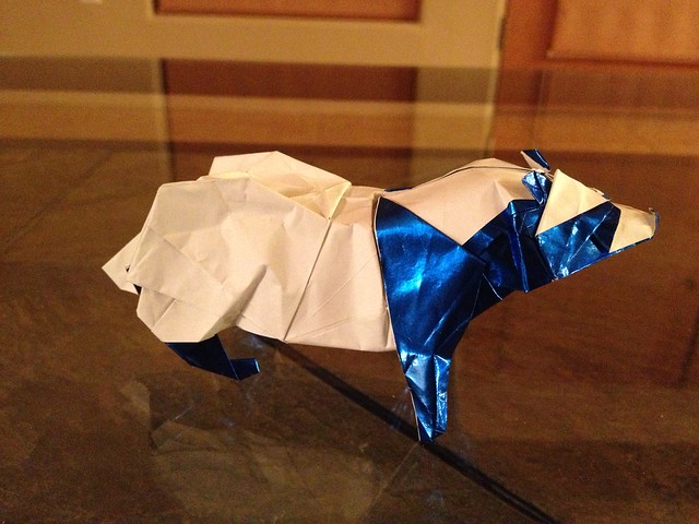
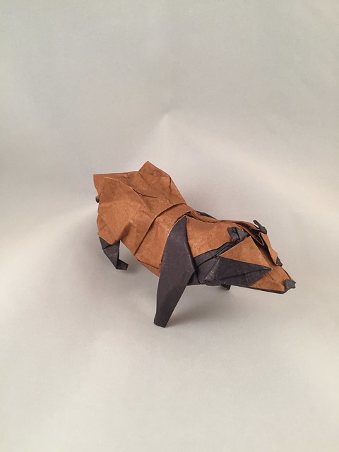
I'm an amateur and a hack folder when it comes to Origami, especially compared to Brimstone and Baltoriamist. Fortunately, it's my hobby, not my day job.

One of my young engineers was with me at lunch and watched me fold a $Shirt to leave for a tip. I explained the landmarks, but he just picked it up by observation ... he doesn't fold. It takes me a few minutes, no more than 3 minutes to fold a tip - roughly the time for the waitress to return with my credit card.

The engineer took 10 minutes to fold his. As we watched him fold his first one, we figured, 'slow beginner, and not that interested in Origami. When he finished, we were floored! It was precise and perfect, and a piece of art. I got mine back from the waitress, and traded with her. We see it framed in the restaurant every time we visit.

When I fold it, it looks like a 'crumbled dollar' compared to his which looked like pristine, proof-condition, crisp uncirculated minted, one of a kind sculpture. ... And, it's not even a hobby for him.

But, he takes the time, and in his Origami, as well as all of his work, he produces Quality. And, this is visible to Everyone. People think my origami is cool, b/c it is unusual. Everyone recognizes his work as Quality and as Art. [On a different note, he has no clue how to self-promote.]

Story #2:
Long, long ago in a place far from here, there were many different flavors of MP3 players ranging from butterscotch to earwax. They were inexpensive and had infinite functions, competing as commodities on increasing technology.

Then, Apple invented the iPod. It does one thing: it stores and plays music. It also has a massive support infrastructure to support it, but the Quality, the feel, the User Experience are what set it apart. Not the technology.

Then, Apple made the iPhone. Other companies competed, making their phones smarter, longer-lived, larger, or with more technology... And incrementally they were left behind, because they weren't even in the same ballpark. They never thought about the Quality, the feel, and especially, the User experience ... and now it's too late. There's a saying that once people try Apple products - iMac, iPod, iPhone, iPad, Apple Watch ... Apple TV... Apple Car :-) they don't switch back. It's not 100% true, but for most people, once they experience Apple Quality, they don't like to switch.

Luxury can be like quality: "Luxury, once tasted, becomes necessity."

If you have the patience [without obsessing forever], Quality wins!
bethnor
Buddha
Posts: 1341
Joined: August 17th, 2006, 9:57 pm

Re: Getting Your Name "Out There"

Post by bethnor »

your photos look fine to me, brimstone. in fairness, i think there's a big difference between sharing photos of your work as a fellow enthusiast and trying to establish yourself as an up and comer. the fact of the matter is, origami is a visual medium. you become more established when you show a design and people say, "WOW!!! i want to fold that!" if your pictures don't show your designs to elicit that reaction, you won't "make it," as it were.

as an example of what a big difference the right paper and photo setup can make, here's kamiya's tanuki from japanese foil, just on a coffee table:

Image

here i did it with tissue foil, and took the photo in a light box.

Image

Image

for the record, the one in tissue foil was actually folded worse--i'd forgotten how to do some of the tricky steps, and had to fold/unfold it a lot.

in case you share the same anxiety as myself, balt, i held off on tissue foil a long time mostly because i disliked the difficulty reversing a crease. this problem is greatly alleviated if you use japanese foil to make your tissue foil, though if you make a duo sheet the problem does come back and you have to take care.
HankSimon
Buddha
Posts: 1262
Joined: August 12th, 2006, 12:32 am
Location: Texas, USA

Re: Getting Your Name "Out There"

Post by HankSimon »

For the record, Brimstone may be humble, but he is very well respected in the Origami community!
User avatar
origami_8
Administrator
Posts: 4371
Joined: November 8th, 2004, 12:02 am
Location: Austria
Contact:

Re: Getting Your Name "Out There"

Post by origami_8 »

Brimstone wrote:About this, how do you avoid the shadow from the lamp light?
Place one lamp to the left and one to the right.
User avatar
Brimstone
Buddha
Posts: 1729
Joined: November 23rd, 2004, 3:59 am
Location: Colombia, South America
Contact:

Re: Getting Your Name "Out There"

Post by Brimstone »

HankSimon: Thanks for your comment.
origami_8 wrote:
Brimstone wrote:About this, how do you avoid the shadow from the lamp light?
Place one lamp to the left and one to the right.
Duh! As usual the simplest solution is the best. Thanks a lot Anna.
User avatar
valerite
Junior Member
Posts: 54
Joined: August 5th, 2014, 7:50 pm
Location: VT :(

Re: Getting Your Name "Out There"

Post by valerite »

I would like to say a few things about diagramming your models.

I've been diagramming for anout 2 years now, and i feel proficient with Inkscape. I think my diagrams are high quality.
How do you know if your diagramms are high quality?
Here are some things I've noticed about diagrams (mostly in convention books ) that I Do Not Like.
1. The paper colour is too dark. I really suggest using 20% grey for coloured and completely white for the white aide of the paper.
2. Diagrams are too small or large. Diagrams should be about 12-15 per page. Make sure each step is a consistant size. Zoom in and out as needed.
3. If the diagrams are in a Japanese style, the light grey line behind is too thick, to thin, too dark, ir too light. I'm pretty sure I use 75 pt line, with 5% grey, but dont quote me on that
4. paper lines are too thick, to thin. Biggest offence is the crease lines are too thick. I use a paper edge line thickness of .6 pt. my crease lines are .3 pt, and my valley/mountain fold lines are 1 pt, as are my arrows. This is important, because it makes sure all lines are visible, and not cluttery.
5. Text is unhelpful. Give some thought to your text, However, make sure that your diagramms are perfectly clear to somebody who can't read the language the diagrams are in.
6. excess/ lack of steps. Even though it makes diagramming go more quickly, don't put too many parts to one steps. 3D intermediate steps are hard to draw, but are really worthi it.

Some other things too, dont make crease lines grey,( they should be black) and proofread for mistakes at least 3 times. step numbers shiuld be visible but not intrusive.
Remember: astheatics!! make your diagrams enjoyable to follow.


Also, I have a very different problem from most of you. I have upwards of 5 models that I need to photograph, but ive actually been putting it off for a few months now :P
steingar
Senior Member
Posts: 437
Joined: May 27th, 2008, 11:34 pm

Re: Getting Your Name "Out There"

Post by steingar »

Both Paul Jackson and David Brill told me they did hand drawings, scanned them and and then touched them up in Photoshop. If the OP has access to photo editing software this might be a viable alternative. That said, I myself do NOT think that complex and supercomplex models lend themselves to such an approach. Tight accurate diagrams seem to match the geist of the models, at least in my opinion.

Once up on a time (when the Earth was still cooling) I met a young folder who lived in the same apartment complex as me. I'd never heard of him, but his designs were utterly captivating, among the most clever I'd ever seen. But they were all made out of notebook paper and such. I told the young designer he would be better off using good paper to show his models to their best advantage. That young man was Sy Chen.

These days folding things out of foil just won't show them off well. Moreover, foil is easily the most difficult thing to photograph because of its shininess. It is possible (and quite facile) to dye the back side of foil, so you get a colorful appearance but the advantage of foil. It is true that the Japanese foils are far more thin than tissue foil, allowing you to create smaller more delicate models.

The other nice thing about tissue foil is it can be made large, so you can have examples of a size that details can be put in definitely and neatly. I think that is very hard to do with smaller foils.

Of course, there are now papers available that can be wet-folded, or you can even make your own. These give truly spectacular results, and really show off models to their best advantage.
Baltorigamist
Moderator
Posts: 2376
Joined: December 25th, 2011, 7:15 pm
Location: Inside my twisted mind....

Re: Getting Your Name "Out There"

Post by Baltorigamist »

Thanks again for all your advice. ^^
After the fall, we rise.

My Flickr
phillipcurl
Moderator
Posts: 1657
Joined: October 25th, 2011, 2:51 pm
Location: Senoia, GA
Contact:

Re: Getting Your Name "Out There"

Post by phillipcurl »

I'm pretty far from well known, and my folds and designs are far from the best. All I can say is what everyone else has been saying - your designs are ingenious. Seriously. Anyone who can understand a crease pattern can see that. But you need to get better paper and better photographs! People that can't read a CP and non-origamists won't be able to appreciate your models unless they are able to understand what is going on.
Also, learn to diagram. It really doesn't take that much time at all to learn inkscape, I learned it in one day or so. I can diagram fine but I am still learning every time I use the program. Just set aside a couple hours and start diagramming. It won't be that good, but it will be a start. My first diagrams compared to what I can do now is a world apart.

Anyways, everything takes time. Getting published is rewarding, and is worth every hour and penny you put into it.
flickr gallery
Youtube channel
Phillip
Post Reply