That is the only part I have troubles with....

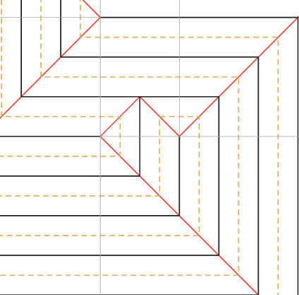
Black: mountainBrimstone wrote:What kind of convention is that? The diagram has solid black lines, solid red lines, dashed
red lines and solid gray lines.


CPs often get too cluttered and hard to decipher if you use the usual mountain and valley folds. That's the reason why often times people will use solid lines instead of mountain folds when drawing CPs. The colour helps to distinguish the lines further. I think there is no consistent set of rules what colours to use, so most of the colours might just be chosen randomly with a good contrast. Not so random is the colour of the grey hinge creases. These as well as the red solid lines change direction as often as they touch another crease. The difference between the two is however, that the red lines need to be precreased, as they are an integral part of the crease pattern. The grey hinges on the other side form as you collapse and many CPs will even omit them at all. It is nice though to have them as a reference but given that they will automatically form anyway, it can be easier to just leave them away when drawing the CP. If someone draws them, their unimportance is often reflected by a light grey colour.Brimstone wrote:What kind of convention is that? The diagram has solid black lines, solid red lines, dashed red lines and solid gray lines.

